
Contrast is one of the best aspects of a photograph. Playing with lights and shadows is incredibly diverse and creative. However, contrasts are not just between light and shadows, they are also between subjects, between colors, and between shapes. Actually, any strong difference between two concepts creates a contrast. From social differences (poverty and luxury, skin differences, costumes difference, brutality, and love etc.) to color differences (yellow and blue, red and green etc.) contrasts catch the eye and tell a story. Even the lack of contrast has something to say and creates a special mood. It isn’t easy to master the contrasts, but it is essential to train your eyes in order to observe them. Knowing what elements of a picture will attract the viewer is what makes a great photographer.
Social contrast
Spotting social contrast is very easy these days. If you go to an impoverished area, the fact that you have an expensive camera is a big contrast. You can see homeless people near luxury shops, beggars in rich markets, tourists in colorful summer clothes visiting strict regime monasteries, and so many conflicting situations.
Social contrast has the power to tell many stories and to show the real face of modern life.

Mood contrast
It is very common to find differences in how people feel. For example, a child can be happy even at a funeral. On the contrary, the sunniest and happiest day can make a boy cry because he lost his kite. People show different emotions. At a wedding, you can find large smiles and big tears. In a park, you can find people relaxing with a book, people struggling with worries or people determined to train for a marathon. People are different and it’s exactly this difference that makes them a very interesting photographic subject. Overlap as many layers and stories you can find. For example, if you locate a spot with a great background, stay in that place until the perfect characters appear. You can visit a place for days or for months until you get the perfect frame.
Color contrast
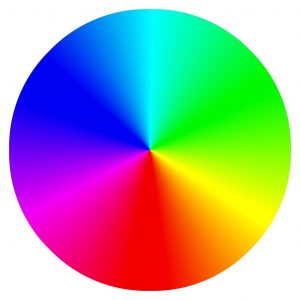
Color is also very attractive and meaningful in pictures. A strong color will overwhelm pale colors, even if the sizes are not in its favor. Always pay attention to color. Try to put in the same frame opposite colors and see the effect you get. Toy around with similar colors. Energy and power are induced by bright, strong colors. Melancholy and sadness are induced by low tonal contrast. If you want to learn more about colors and their contrasts, use the color wheel.
 Light and dark tones
The more conventional contrast, the one between very dark and very bright tones, is achieved based on two dynamic ranges: the subject’s dynamic range and the camera’s dynamic range. We define the dynamic range as the difference between the darkest and the brightest parts of the subject. If the camera has a smaller dynamic range than your subject, you will get an overexposed or an underexposed picture. The extremes of the subject’s range will blend in white or black. To make sure this doesn’t happen, learn how large is the dynamic range of your camera. Use the histogram to find out exactly the camera’s dynamic range.
Contrast is a beautiful tool to work with. It enhances your photos, it makes them rich and meaningful. Just a simple difference can say so much about your subject. Explore it and use it wisely. Use wide lenses and a deep depth of field to keep everything in focus. Balance colors, shapes, and textures. Sometimes, contrast can be enhanced using post processing software, but try not to rely too much on this.